In an attempt to create more than I consume, one of my goals this year is to make more tangible art. So far this has resulted in a lot of googling tutorials to learn Affinity and Inkscape, a series of new pinterest boards, and more doodling and drawing in the margins of my notebooks. ‘Tangible’ has meant treks through the snow to various printing shops around town in order to print postcards to send and deliver to friends and loved ones. There’s something pretty great about holding something you’ve made in your hands.
Here’s a quick tour of some of the art I’ve made so far:
Je Suis Riche
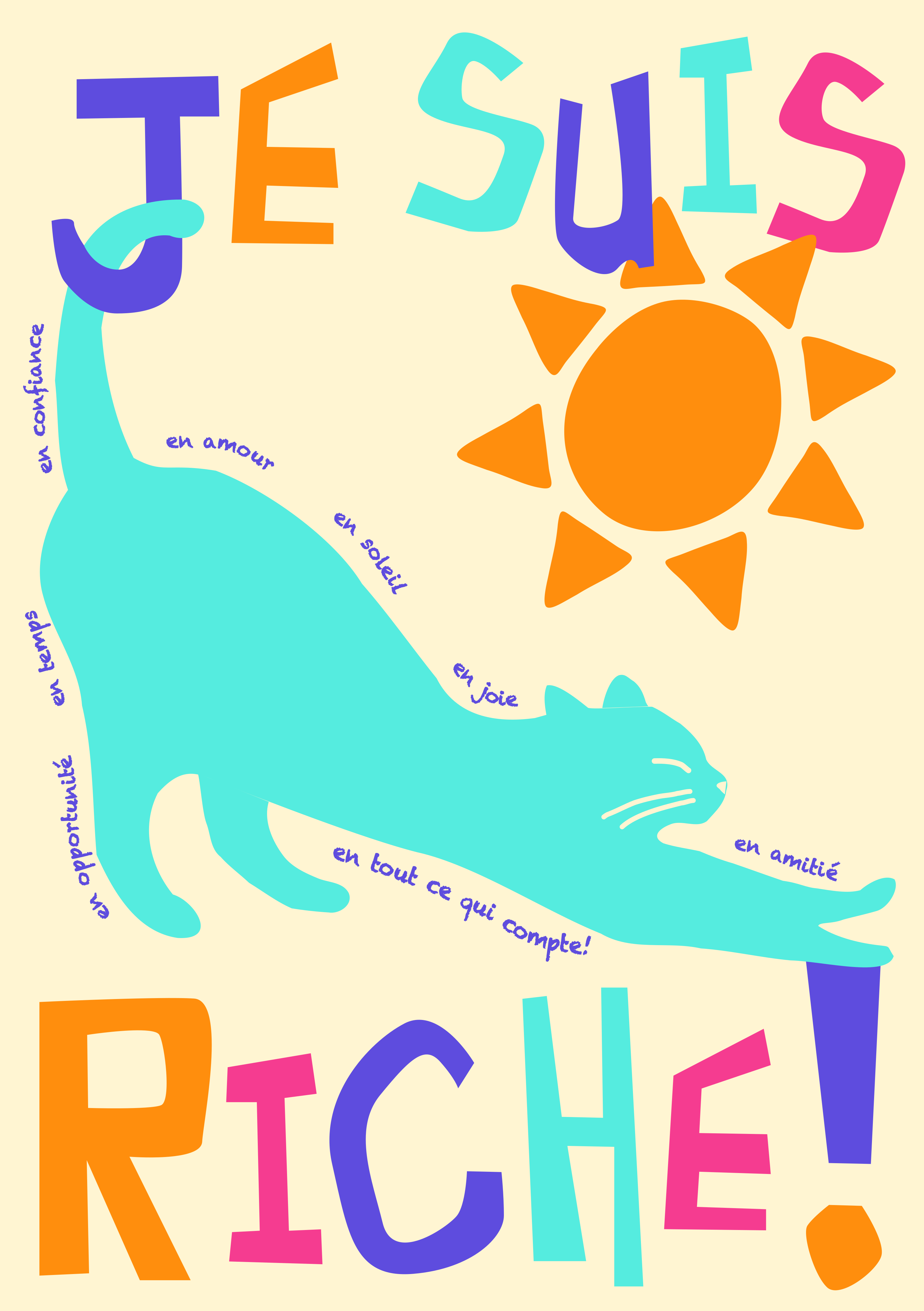
I started off by following edgykatarina’s tutorial: ‘how to design and print a poster (using adobe illustrator) | make your own wall art tutorial’. I don’t have adobe, and I am not willing to subscribe to their (incredibly expensive) saas model just yet, so for this tutorial, I turned to Inkscape, a free vector graphics editor. After a couple rounds of The Bezier Game to better understand how to use the pen tool, I made a French version of Katarina’s poster to send to my grandmother:
Things I learnt:
- Inkscape’s ⌘L for smoothing lines is great.
- There’s probably a better way to make certain vectors overlap and intersect, but here I ended up just copying and pasting duplicates and it worked out fine for the png.
- A friend pointed out after that the title looks like ‘Jesus’. I could stand to leave more space between words.
Birthday Flowers
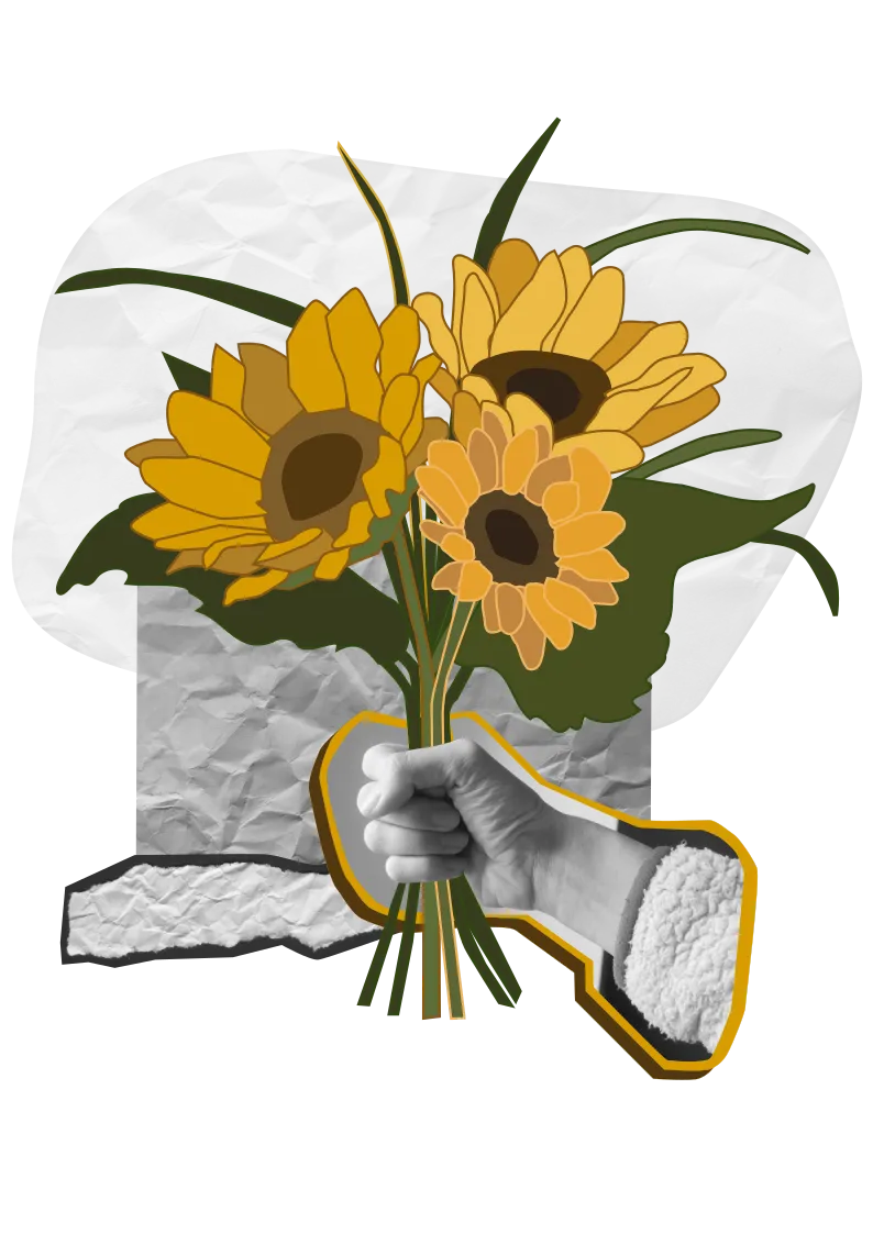
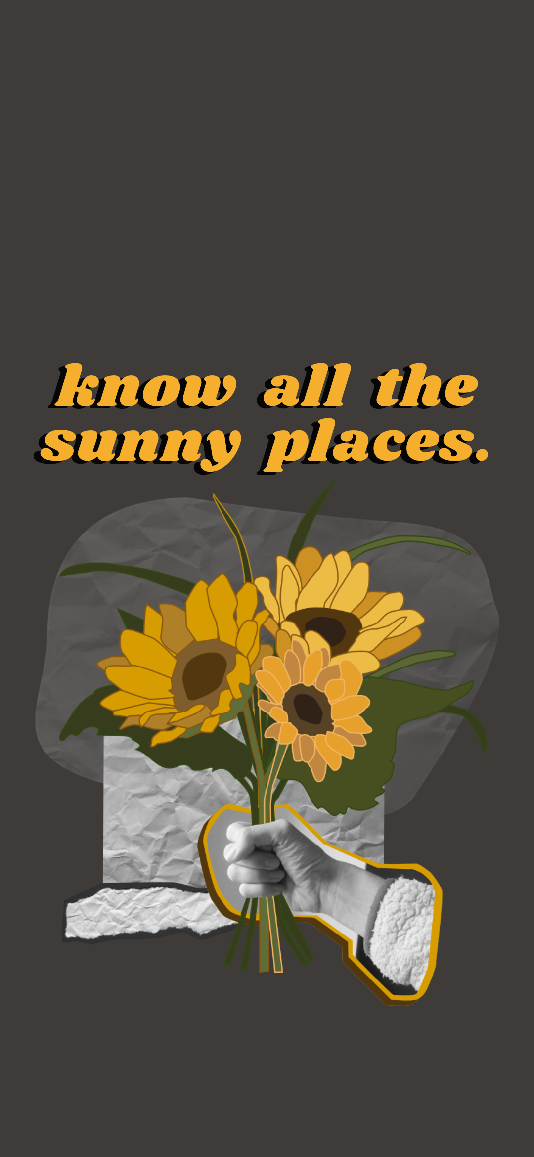
For my mum’s birthday, I made a bouquet of flowers in Inkscape. My mum’s favourite colour is orange, and I liked the idea of giving her sunflowers even though we’re 14000km apart.
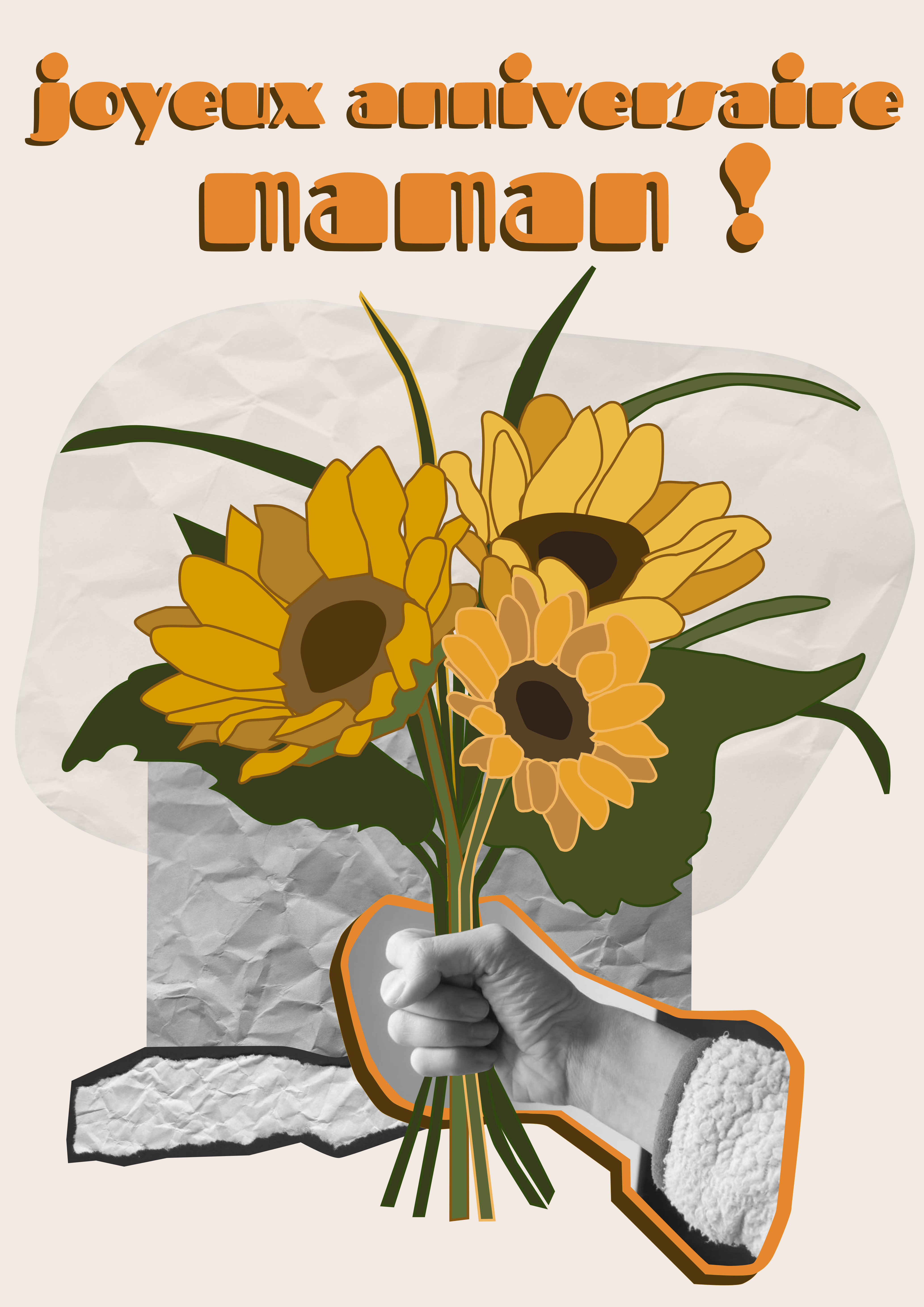
My hack for fonts is screenshotting the text I want from Google Fonts, or Adobe, and then importing the image into Inkscape and tracing the bitmap to turn things into curves. It’s not great if you want to do any manipulations to the text, but for the sake of a poster, it allows me to bring in more interesting fonts.
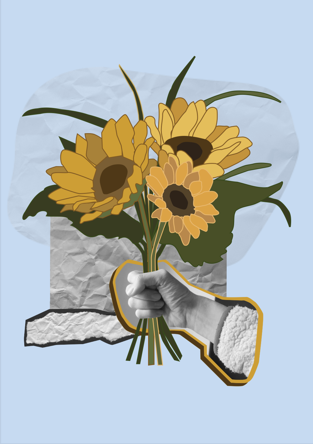
I then reused this asset for different cards and a phone wallpaper (with a quote from the book ‘All I need to know I learned from my cat’).

A Thank You Card
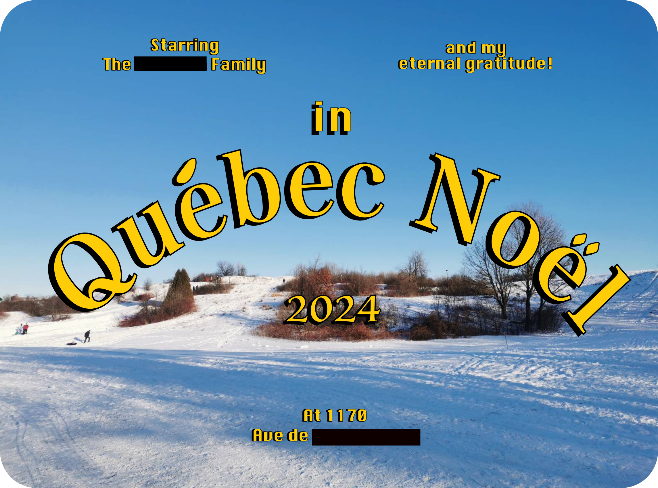
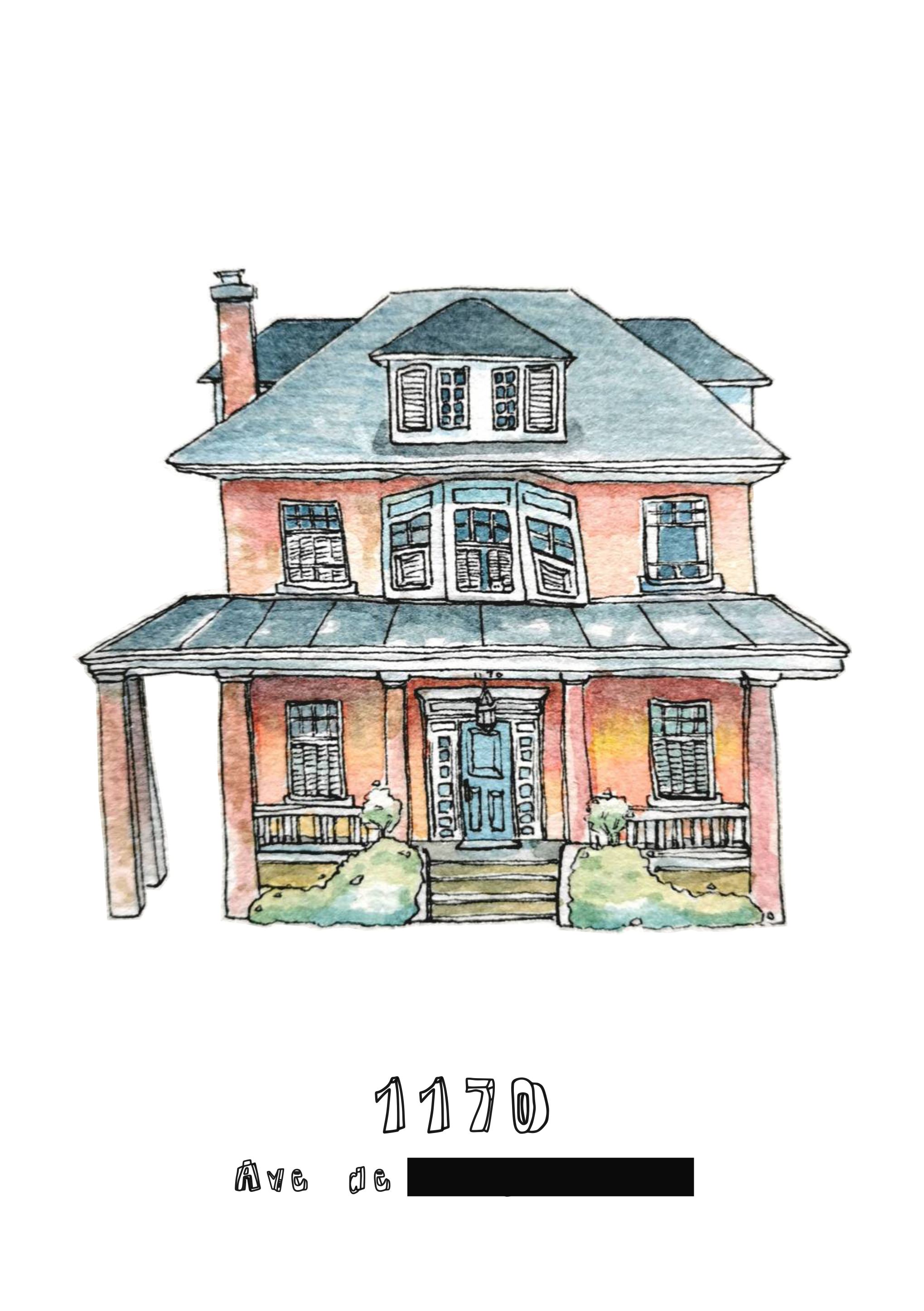
I sent a thank you card to the friends I spent Christmas with - this was a watercolour painting I did and then scanned and copied into Inkscape. I watched my secret to making cool title cards and fun typography (an adobe illustrator tutorial) to make the title card.
An Art Night Event Poster
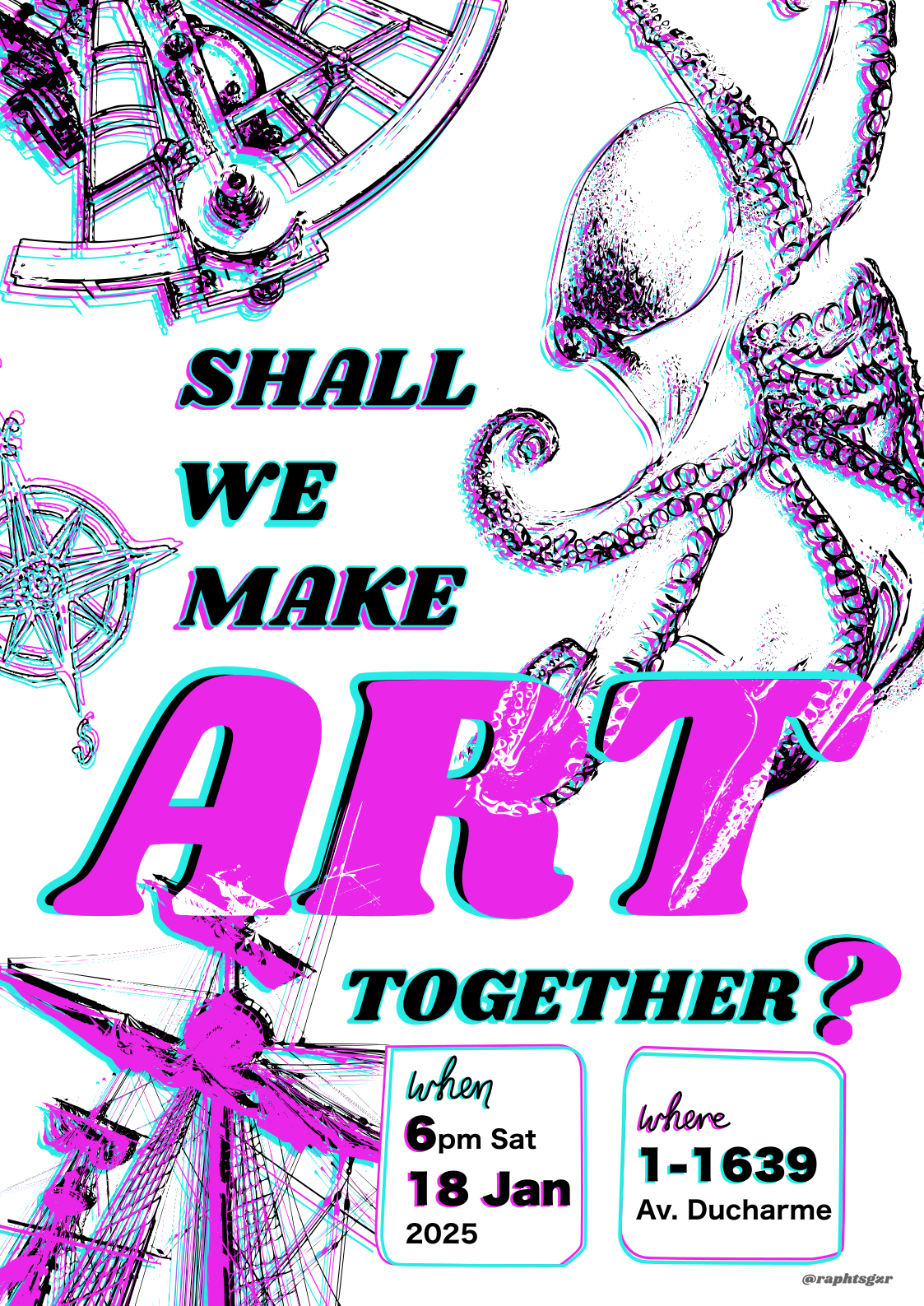
I made a glitchy art night poster inspired by the fact that I was reading The Ministry of Time - Naval paraphernalia had seeped into my brain. I made full use of Inkscape’s trace bitmap functionality. Printing this design allowed me to experience what happens to RGB colours when printing and why you should use CMYK for print.
Our Friendly Neighbourhood Racoon
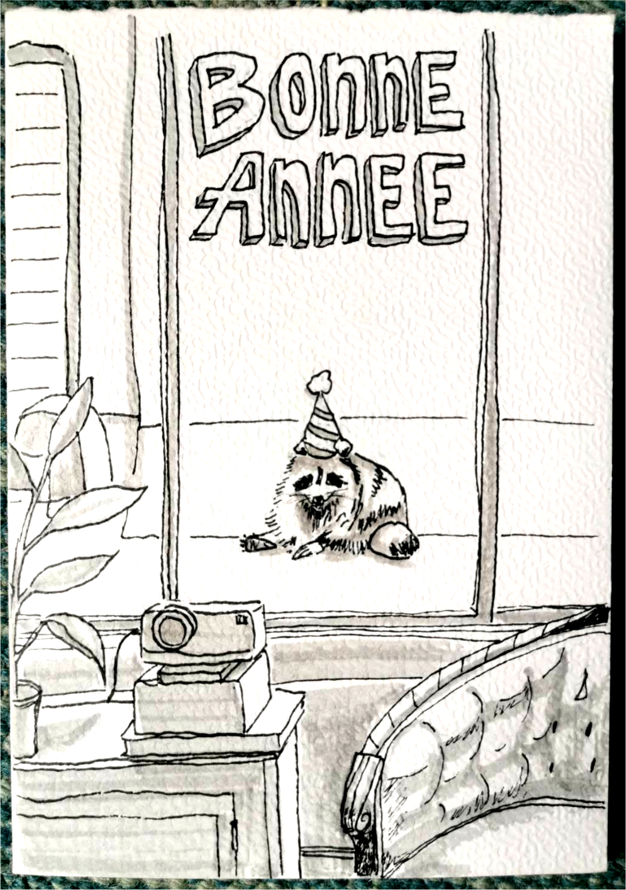
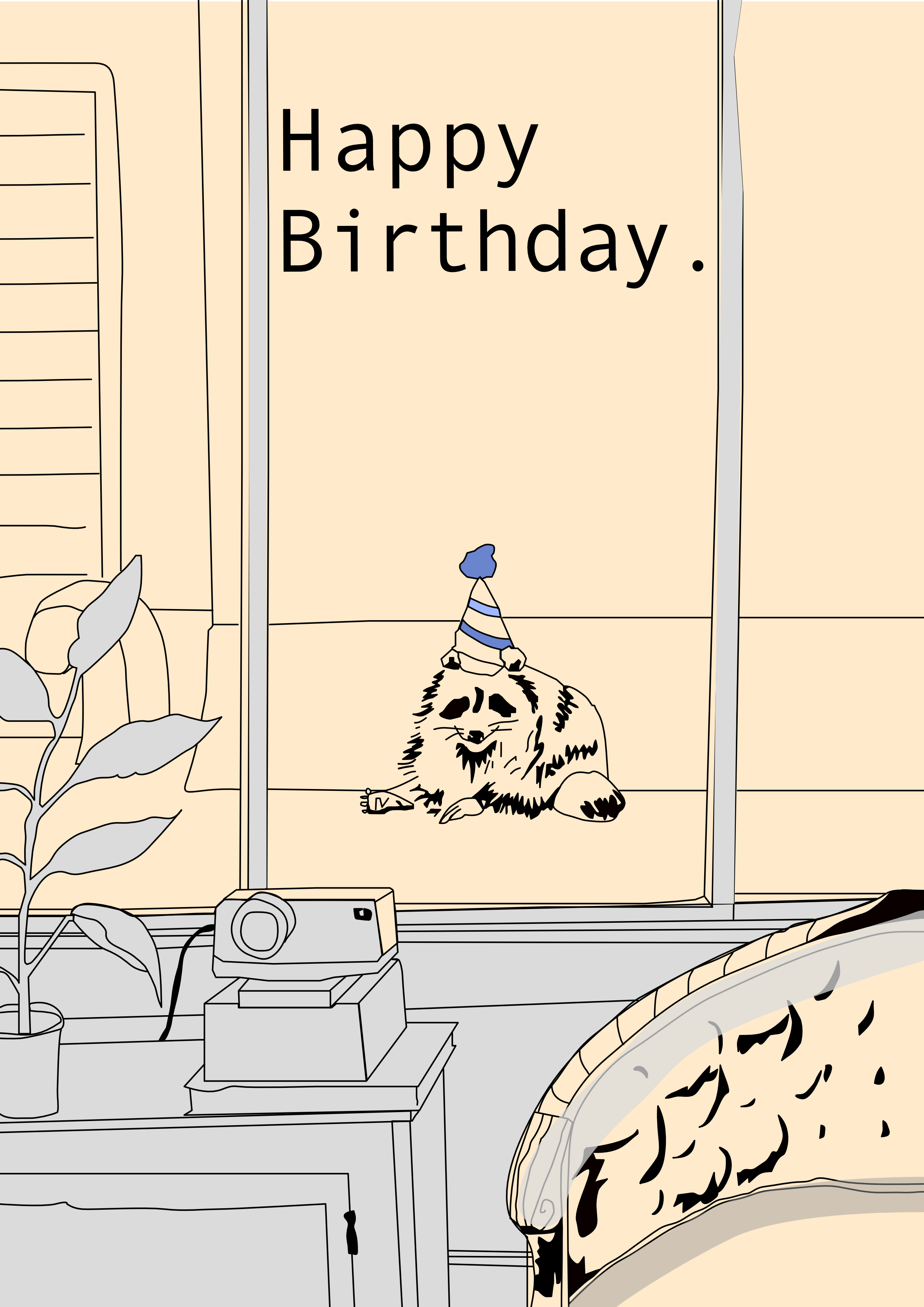
I made a card for my friend inspired by the local neighbourhood racoon, first with pen and grey highlighter, and then traced in Affinity Designer (using their free 7 day tutorial! Either way, a more afforable alternative to Adobe).
Vue de Bellechasse et Saint-Vallier
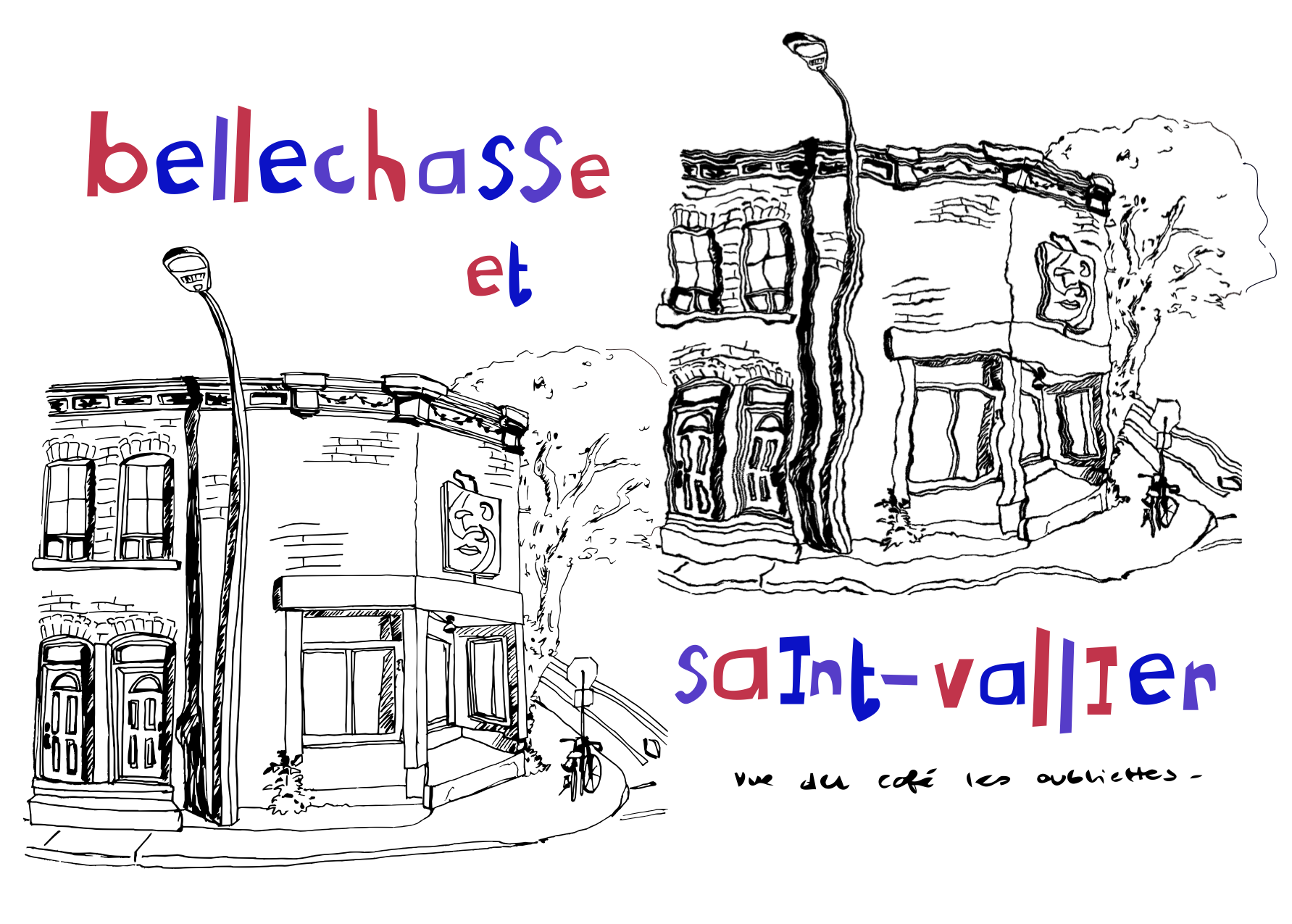
Experimented with the filters you can add in Inkscape with this trace of a sketch I made at the Cafe les Oubliettes to create this postcard:
Climbing Posters
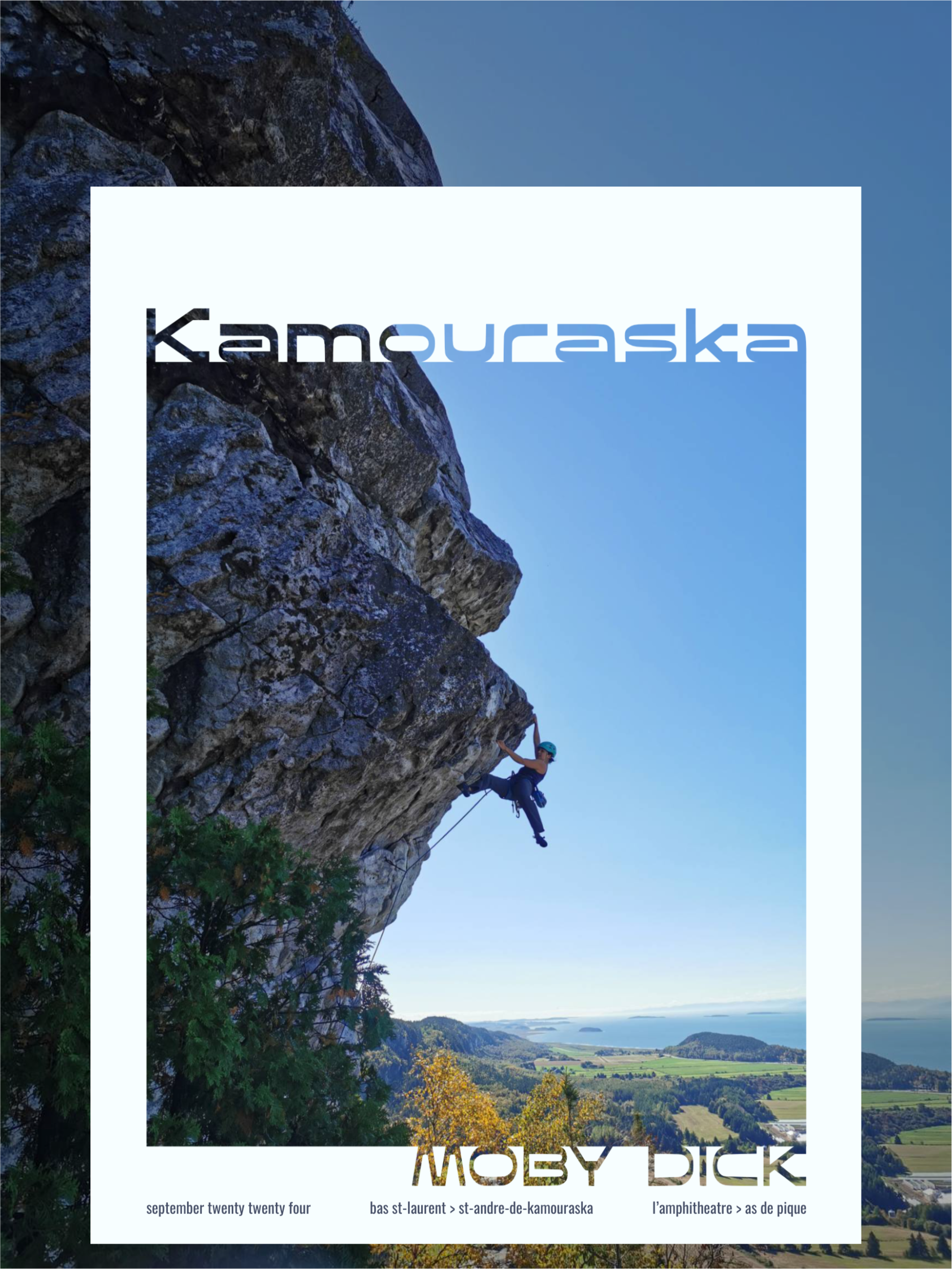
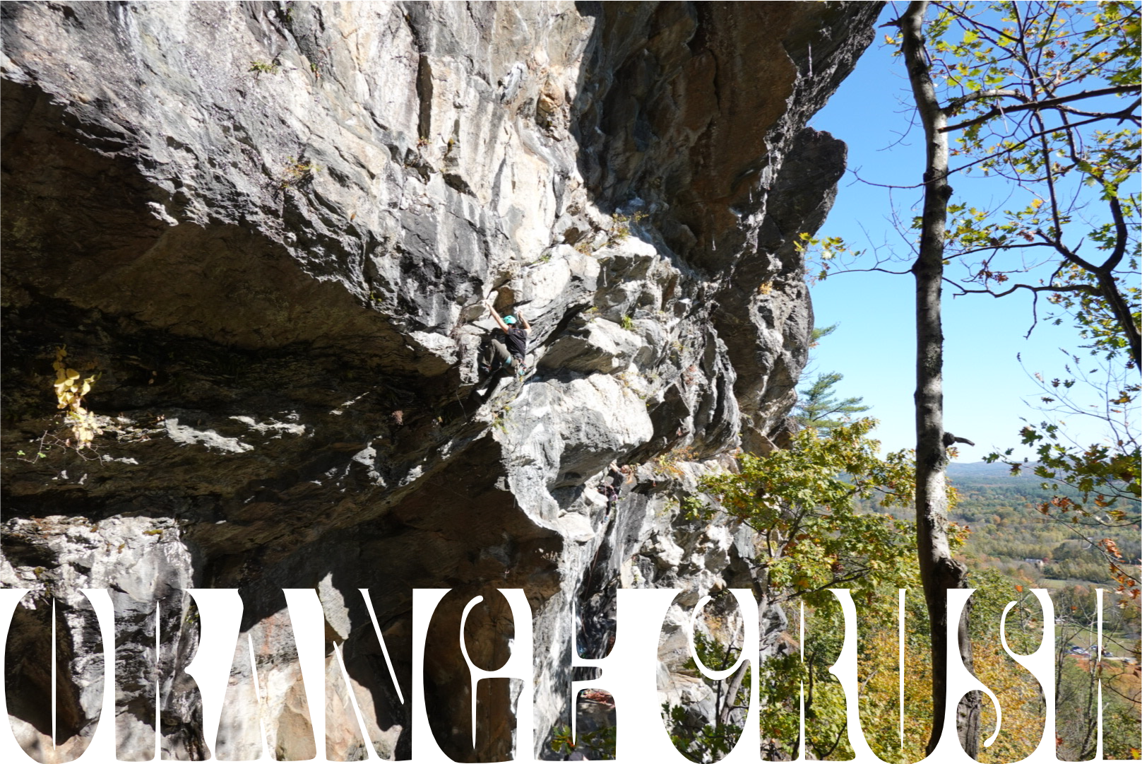
Inspired by this poster, I edited some climbing pictures from the Fall using Inkscape and Affinity Designer, converting images to curves to intersect them with text:
Hi-Bonjour d’Angrignon
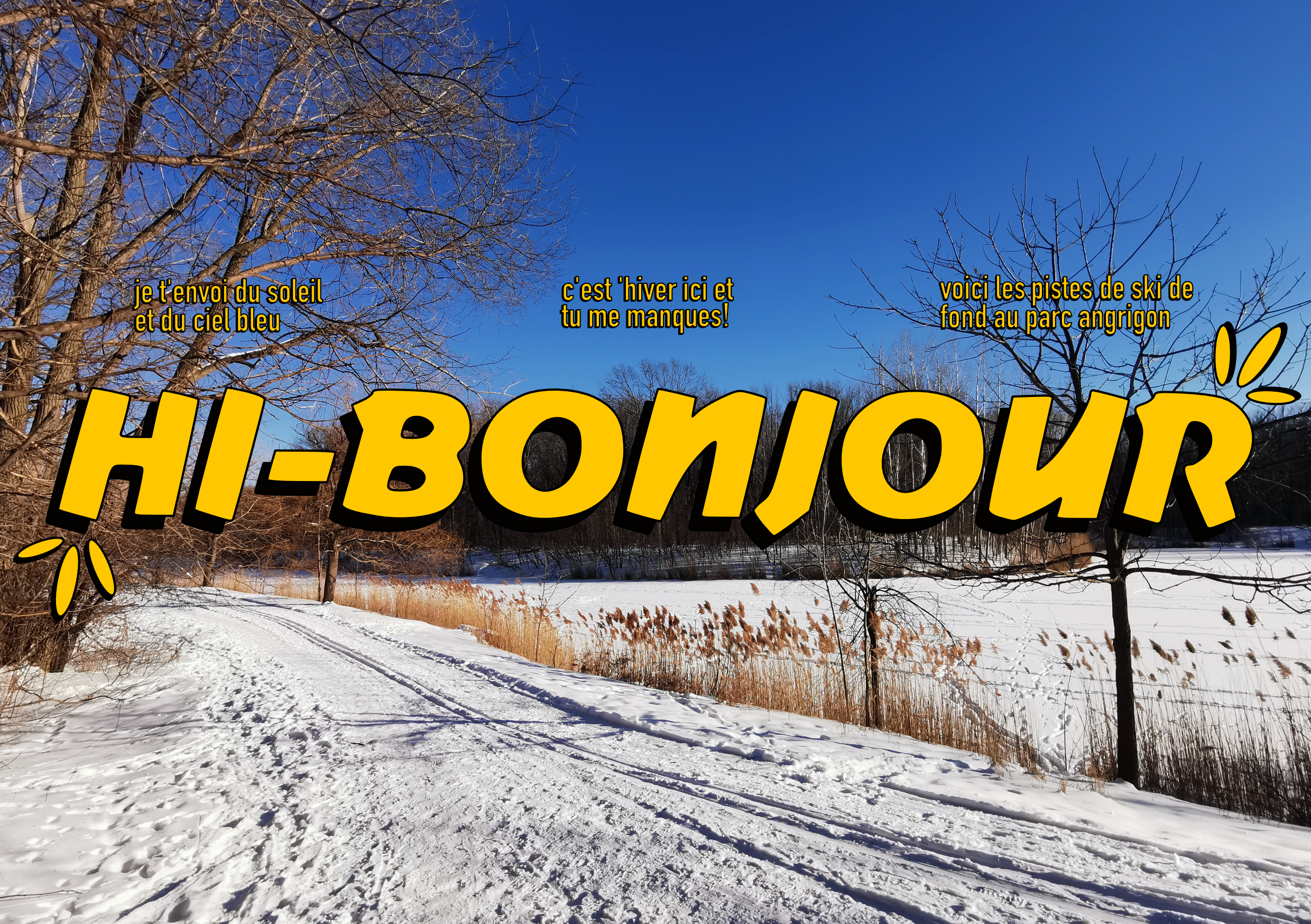
I saw the Sugar Sammy billboard this month with ‘Hi-Bonjour’ written in large and it made me laugh so hard I made another postcard title card using it:
Shophouses
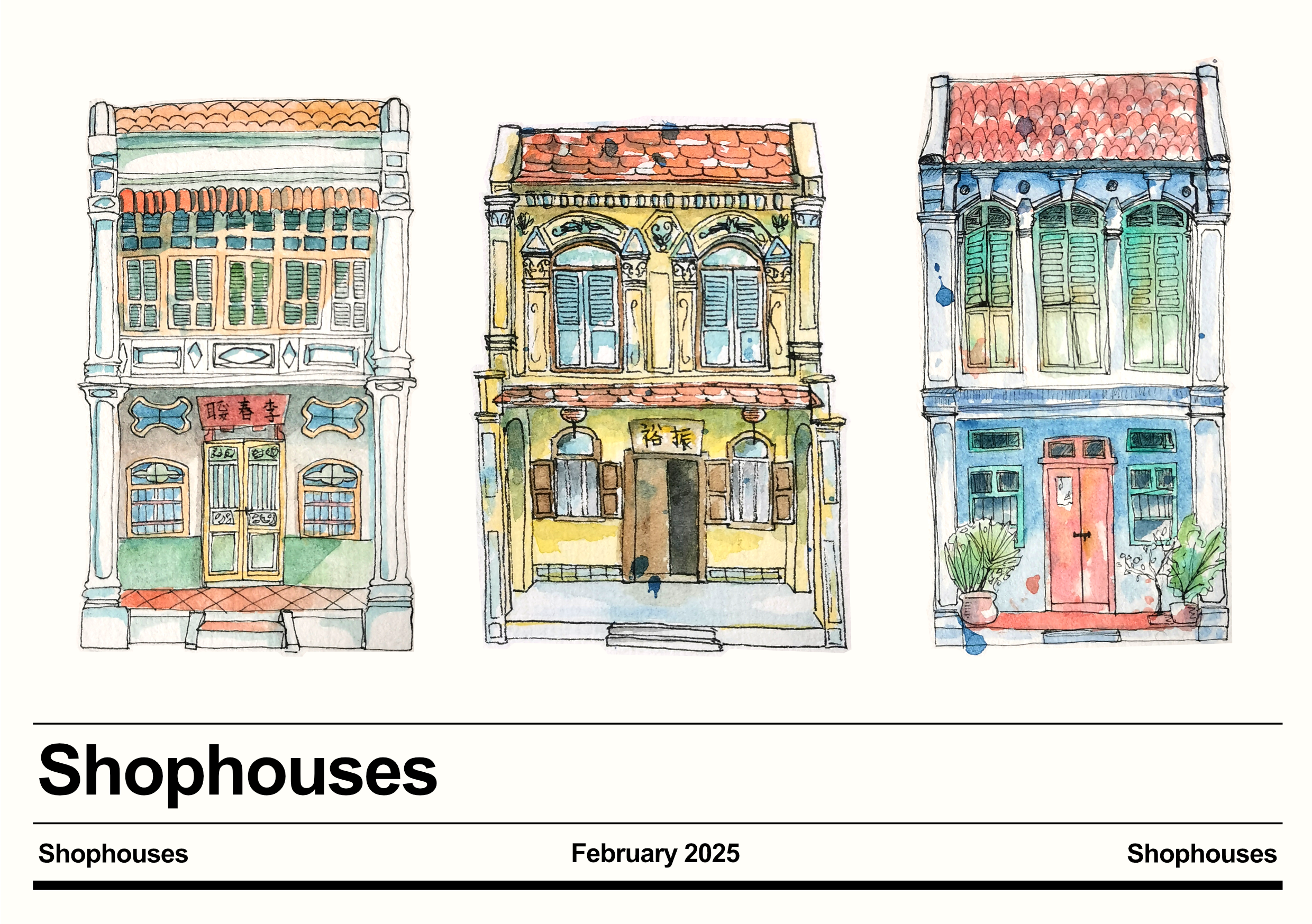
And finally, I turned some watercolour shophouse paintings into a digital poster/card by importing pictures into Affinity, converting them to curves and intersecting them with a traced shape to crop close to the outline, and adjusting the levels (Layer > New Adjusmtent > Levels > Dropping the White Level to around 75%). The text portion was inspired by an olive poster at a local cafe down the street.
Conclusion
- Making art is fun!
- New tools will always have learning curves.
- Inspiration comes from lots of places.
- Mixing media is cool!
Thanks for coming on this tour of my art so far :)
